Friday, 18 March 2011

56 Vincent Square SW1

To celebrate the bicentenary of the enclosure of Vincent Square as playing fields for Westminster School in 1810, the residents association put up a rather jolly half-relief portrait of the man who got it done, William Vincent, Dean of Westminster and former headmaster of the school.
At the time, the whole area was a boggy place owned by the Abbey, known as Tothill Fields. Dean Vincent saw it was being developed piecemeal and the school risked losing the area it had always used for recreation. He paid a bloke called Jonathan Green £3 to mark out ten acres of land, plus £2 4s for a horse and a plough to dig a deep furrough round it.
Vincent was a respected headmaster, known for his cry of ‘Eloquere, puer, eloquere’ (‘Speak out, boy!, speak out!’), though his vigorous use of corporal punishment would not be acceptable today. He expelled the future Poet Laureate, Robert Southey, for writing an article against the practice called The Flagellant.
The terracotta roundel is by Karen Newman, who based it on a portrait by William Owen, court painter to the Prince Regent. It livens up the corner of an extremely dull block of flats erected in 1994.

Tuesday, 15 March 2011

Globe House, Temple Place EC4

Globe House is a typical 1990s post-modern affair by GMW Partnership, with classical references and faced in Portland stone, and they had the good taste to retain a couple of lovely statues from the previous building on the site, Electra House by Sir Herbert Baker, built in 1933.
The life-size bronze figures of Mercury are by Sir Charles Wheeler. They stand gracefully on columns, each brandishing his snakey stick or caduceus with elegant insoucience. The model was a musician, artist and body-builder called Charles Assirati, cousin of the famous champion all-in wrestler Bert Assirati. Wheeler also used Assirati's torso for the merman in the Jellicoe fountain in Trafalgar Square.
As I was taking the photographs from the public pavement, a rather nice lady receptionist came across and told me that I must stop because it was 'against company policy'. I politely explained that the law of the land overrode company policy. Then a less nice security man said I had to stop, and fiddled threateningly with his radio. A member of the public backed me up, describing the company position as 'outrageous'. Then I took the rest of the pictures I wanted and we all left in anger.
Outrageous is the word. Even the police have stopped hassling photographers going about their legitimate business. If London's bloggers descended on the Globe House one fine day and held a mass snap-in just to get up the noses of the security men, it would serve them right.

Friday, 11 March 2011

Natwest Bank, 1 Prince's Street EC2

Ten years after he created the caryatids at the entrance of P&O in Cockspur Street, Ernest Gillick returned to the figure of Britannia for an allegorical group on top of the new headquarters of the National and Provincial Bank (now the NatWest).
The architect was Sir Edwin Cooper, a dyed-in-the-wool traditionalist, who was having no truck with the modern sculpture that had just appeared on the rebuilt Bank of England over the road. As a result, the decoration of 1 Prince's Street could just as well date to 1909 instead of 1929.
It is a lovely group. Britannia rises on a winged seat, flanked by Mercury (representing Commerce) and Truth with his torch.
At Britannia's knees are crouching nude females representing Higher and Lower Mathematics. Higher Maths, on the left, holds a carved 'magic square' a grid of numbers, almost any four of which add up to 34, the number associated in astrology with Jupiter. The square features in Durer's famous engraving Melencolia I and in Dan Brown's recent extrusion, The Lost Symbol.
The symbolism oozes with irony today, after a decade in which the financial sector cynically abused mathematics to loot the world, then hid the truth until economic meltdown was just days away and Britannia was close to ruin.

The building was adorned at ground level with serenely classical statues symbolising financial virtues, by Sir Edwin's favourite sculptor Charles Doman. 
The figures on the Prince's Street facade represent Security and Prosperity.
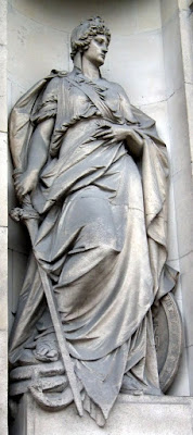
Security is a veteran soldier wearing a Phrygian cap (for Liberty) and a pauldron or shoulder-plate with an embossed lion's head. He holds a key and a bridle, and stands on books and scrolls.
Prosperity is a graceful girl with one foot on a cushion and holding some fruit from a basket on an ornately-carved bracket behind her. A wreath and more scrolls lie at her feet.

Two more allegorical figures by Charles Doman stand on the south facade. Courage is a female, unusually, holding a sword with which she has just slain a snake. So very unlike my dear lady wife, who hates swords almost as much as she fears snakes.
Integrity is venerable man with a beard, holding a locked ledger and standing on a pile of more ledgers. The light of truth is at his feet.

Thursday, 3 March 2011

14-16 Cockspur Street, SW1

Cockspur Street was where you went to buy a ticket on an ocean liner. All the famous names were there including, up to 1914, the German Hamburg America Line, whose flagship Deutschland held the Blue Riband for the fastest transatlantic crossing in the first few years of the 20th century.
Hamburg America Line built one of the grandest buildings on Cockspur Street in 1906, to the designs of A.T. Bolton and featuring a riot of sculpture by William Bateman Fagan.
During the First World War, Fagan worked with Francis Derwent Wood at the 3rd London General Hospital making facial masks for disfigured soldiers and sailors. At the end of the war, his magnum opus at Cockspur Street was seized as reparations and presented to P&O. Nowadays, the tenant is the Bank of Scotland but you can still see the P&O logo carved in the piers between the windows on the attic storey above the entablature. If you look very carefully, behind the logos are the ghosts of the letters HAPAG, for Hamburg-Amerikanische Packetfahrt-Actiengesellschaft.
The bay over the office entrance is emphasised by an ornate bay window and a complex pedimented affair that was originally the base for a stone lantern. At the top is a monstrous head of Neptune with a long flowing beard merging into a diving eagle carrying a fish in his beak. To left and right, merfolk hold sceptres.
Under the curved, broken pediment are two figures symbolising the great liners. On the left, a woman wearing an uncomfortable-looking embossed metal corset holds a model liner [the Deutschland herself - see comments]. A cherub kneels by her side holding an anchor. On the right,a man holds another ship model [the Amerika] but he is comfortably swathed in a cloak. An eagle perches beside him.
Below, the bay window is topped by a carving of a ship's bow with a stylised bow wave. The figurehead is a mermaid holding on to the beakhead, her bifurcated tail snaking through the timbers. It has to be admitted there is something rude about a mermaid with two tails. Starbucks used one as its original logo but changed it after protests from public decency lunatics.
The three bay windows are decorated with reliefs of Greek gods carved by Fagan, each flanked with boys riding either dolphins or hippocamps.
On the left is Dionysos, the god of wine, in a ship with a lion. According to Homer, Dionysos was kidnapped by pirates who wanted to sell him into slavery, believing his exceptional good looks would fetch a high price. He turned himself into a lion, and all the pirates leapt overboard. Mercifully, he turned them into dolphins.
The other panels are of Europa and her bull (the god Zeus, who today would be on all sorts of registers) and Icarus flying too close to the sun.
This is interesting. Here is a shipping line in 1906 depicting the world's first fatal flying accident in stone, just as aeroplanes were coming in - the Wright brothers had flown in 1903. Flying was the hot topic at the time - did HAPAG see the writing on the wall for ocean liners?

When P&O took over Hamburg America Line's building in 1918 as part of Germany's reparations for the war, the company lost no time adapting it for their own use. The ground floor booking hall was completely revamped, and the entrance marked with an extraordinary bronze relief by Ernest Gillick.
The theme of a pair of figures representing each end of the liners' routes is repeated, but this time they are caryatids symbolising Britain on the right and the Orient on the left. A pair of putti repeat the theme, one holding Britannia's trident and the other a lotus flower. They stand confidently on ship's yards.
At the centre is a rising sun with P&O's motto Quis Separabit (from Romans 8:35 and the motto of several British regiments).
I love the way that Britannia stands in a strong, confident but no-nonsense stance, whereas the dusky oriental lovely has a slight but sensuous swing to the hips.
Thanks to Beth Ellis of the P&O Heritage Collection for her help.